
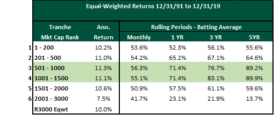
In the last post in this series, we update and expand on our analysis to explore the impact of rising and falling interest rates on the performance of various capitalization tranches. As a reminder, in Part 1 of this series we looked at the 6 market capitalization tranches in the Russell 3000 and determined that market cap tranches 3 and 4 which constitute the top 1000 names in the Russell 2500 make up a “Sweet Spot” for investors. In Part 2, we delved into some of the reasons behind this edge. Finally, we now look at the performance of the “Sweet Spot” in different interest rate regimes.
Source: FactSet, PIA
To answer this question, we analyzed the returns of the various tranches within rising/falling interest rate regimes as defined by changes in the US 10-Year Treasury yield. The graph below shows the 10-Year interest rates over our test period (Dec 31, 1992 to Dec 30, 2019). While the entire period was marked by generally declining interest rates, there are clear periods of rising rates (shaded areas) over shorter time spans.
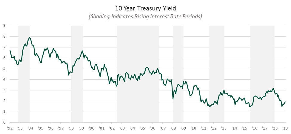
Source: Bloomberg, FRED
The table below summarizes returns in periods of rising rates. Returns for each period are color-coded with green denoting the highest return, yellow for median and red for the lowest (with gradations between).
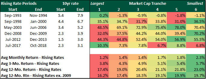
Source: FactSet, Bloomberg, PIA
The smallest stocks (tranche 6) generate the best returns when interest rates are rising, while the largest (tranche 1) underperform. This seems intuitive given that rising rates typically occur in the initial, “risk on” phase of the economic cycle. The results are exactly the opposite in falling rate (late cycle) environments, as the table below illustrates.
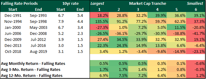
Source: FactSet, Bloomberg, PIA
We note that the “Sweet Spot” (tranches 3 and 4) performs more consistently in both periods. When rates fall, medium-sized stocks beat their larger cap counterparts and when rates rise they lead the small/micro cap companies. If we exclude 2009 from our analysis, the return advantage of small/micro caps is negligible in rising interest rate periods.
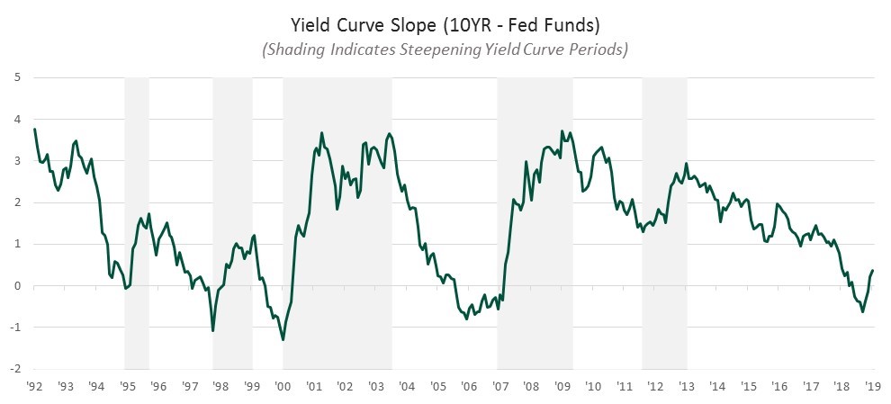
We expanded our analysis further and considered the shape of the yield curve and its impact on shifting equity leadership. Economic cycles are typically characterized by the shape of the yield curve or, more specifically, whether the yield curve is steepening (early cycle, dovish Fed policy) or flattening (late cycle, Fed tightening, maturing economy). The next graph illustrates the slope of the yield curve over time as measured by the spread between 10-Year Treasuries and the Fed Funds Rate.
Source: Bloomberg, FRED
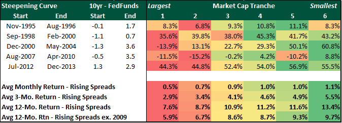
The table below summarizes returns for periods when the yield curve is steepening (shaded areas above).
Source: FactSet, Bloomberg, PIA
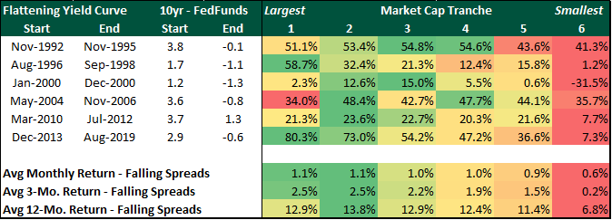
The return advantage of small and micro caps (tranche 6) is even larger in these early cycle periods, even when we exclude 2009 from the analysis. The table below illustrates the impact of a flattening yield curve on the various market cap segments. As we might expect, these late cycle periods favor medium-sized stocks while smaller stocks underperform.
Source: FactSet, Bloomberg, PIA
The shape and trend of the yield curve has historically been a strong indicator of where we are in the economic cycle. In early, expansionary phases, risk is rewarded, and small stocks generate hyper-returns. As the curve flattens, small and micro caps lag significantly.
The analysis shows that tranches 3 and 4 display the most consistency and the least volatility of performance in different interest environments defined by either levels of or trends in interest rates. In all scenarios, the “Sweet Spot” stays sweet and provides an attractive space to invest in.The shape and trend of the yield curve has historically been a strong indicator of where we are in the economic cycle. In early, expansionary phases, risk is rewarded, and small stocks generate hyper-returns. As the curve flattens, small and micro caps lag significantly.