
View PDF version Battening Down The Hatches Part Two
Part 2: How Should Investors Derisk?
In Part 1 of this series, we posited that the next recession could take two possible forms:
- A traditional cyclical downturn as decelerating industrial production infects the consumer economy
- Stagflation, caused by a negative supply shock occurring in an environment of either weak or negative economic growth
As discussed below, we believe that the most likely scenario would be a combination of the two; i.e., decelerating industrial production infects the consumer economy, with the recession prompted by a bear market in risk assets, catalyzed by either an inflationary or a deflationary shock. In either case, we believe that the next market decline could be exacerbated by the unwinding of excessive risk taking and leverage that has resulted from over a decade of ultra low interest rates.
In Part 2, we will evaluate the macro background, asset return sensitivities and market responses during economic downturns over the last 30 years. For stagflation, we will evaluate the 1970s and 1980s as well as periods of heightened changes in inflation expectations and bottom quartile growth from 1970 to the present. However, because several key variables (such as bond yields, inflation, valuations, monetary policy settings and growth) are very different today than at the beginning of these past downturns, we will also evaluate how asset returns may differ in the next downturn; whether it takes the form of a traditional cyclical downturn or stagflation. We therefore close with an analysis of which assumptions need to be revisited and which asset relationships would appear to be unsustainable.
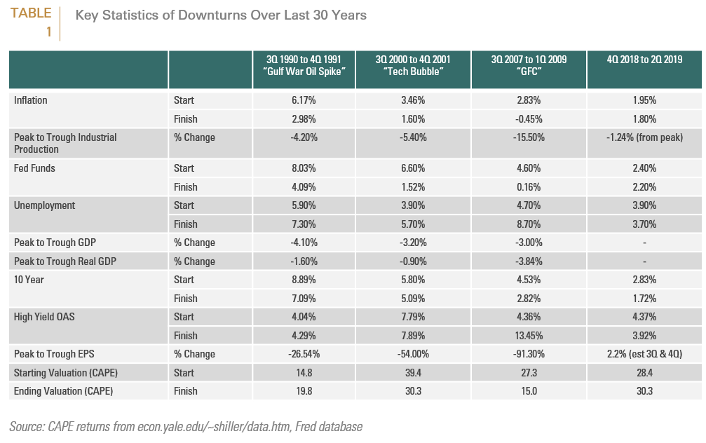
The 3 recent downturns listed below were preceded by rising interest rates as a result of Fed policy. The 1990s “tight money” recession, could also be considered as a mild supply shock recession in that it was also precipitated by the invasion of Kuwait by Iraq. This resulted in a spike in the price of oil in 1990, which caused manufacturing trade sales to decline. The stock market decline of -6.56% in 1990 was also precipitated by the collapse of the leveraged buyout of United Airlines in 1989. For both the tech bubble and the global financial crisis (GFC), industrial production declined by 5.4% and 15.40%, respectively. Notably, both coincided with the bursting of an asset bubble in which valuations became detached from their intrinsic value in the case of dot com and telecom stocks, and relative to income levels in the case of the housing bubble.
 During the modern Fed era, cyclical downturns have established the following familiar pattern:
- Prior to the downturn, the Fed raises rates in an attempt to return to a “neutral” rate
- Growth/earnings assumptions can no longer be sustained by higher interest rates
- Capital investment and industrial production fall precipitously
- Credit spreads widen to reflect companies’ more precarious financial condition (due to both falling growth and higher interest rates)
- Equity market earnings fall according to the decline in economic growth (I.P. tracks Real GDP)
- Equity markets decline, depending on the severity of the EPS decline and valuations
- Unemployment rises and inflation falls
- The Fed reacts quickly by sharply cutting rates
- Yield curves steepen (primarily due to short rates falling)
Fed Policy over the last 40 years
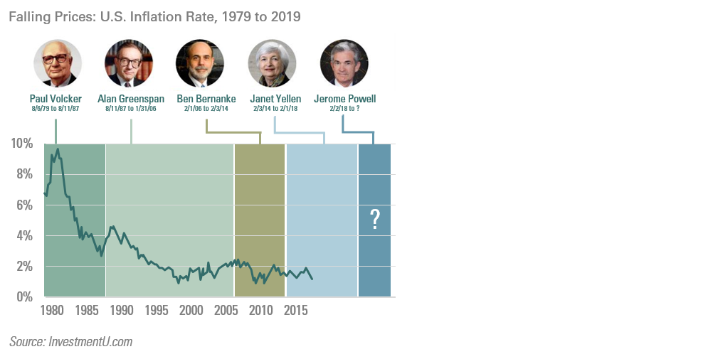
The post Bretton Woods era of the Federal Reserve was ushered in by Paul Volker in the late 1970s following the Federal Reserve Reform Act of 1977, which explicitly set price stability as a national policy goal and the Full Employment and Balanced Growth Act, which formalized full employment as a second goal of monetary policy. Two months after his confirmation in August of 1987, following the October 1987 stock market crash, Alan Greenspan established the modern monetary policy approach to constrain financial market declines when he affirmed the Fed’s “readiness to intervene as a source of liquidity to support the economic and financial system”. This approach became known as the “Greenspan put”; whereby when a crisis arose, the Fed would often lower the Fed funds rate, often resulting in a negative real yield. The Greenspan Fed injected funds to avert further market declines associated with the savings and loan crisis and Gulf War, the Mexican crisis, the Asian financial crisis, the LTCM crisis, Y2K, the burst of the internet bubble, and the 9/11 attacks. Similarly, in response to the GFC, Chairman Ben Bernanke continued the practice of reducing interest rates to fight market falls and, critically, resorted to less conventional measures to inject dollar liquidity into the system through various asset purchase programs. Chairman Yellen used further measures through the Shanghai accord and by lowering the dot plots. Chairman Powell at first continued the interest rate hikes that began in late 2015 but in 2019 reversed course; leading the market from pricing in four hikes this time last year to pricing in four cuts.
This policy of continuously injecting monetary liquidity to stem sharp drops in risk asset prices has ultimately lowered risk premiums and thus flattered the valuations of risk-seeking assets whose return are primarily driven by expectations around higher residual values (as opposed to current cash flow yield) and fostered valuation re-rating. Consequently, the global macro financial system has become increasingly dependent on massive, persistent and accelerating liquidity injections.
Table 1 suggests three key difference between today’s macro backdrop and the most recent period. First, as of June 30, 2019, the equity market’s cyclically adjusted (CAPE) valuation of 30.3 is higher than it was at the end of all bull markets that preceded a subsequent equity and cyclical downturns with the exception of the end of the dot com era. The other glaring differences are levels of inflation, the yield on 10-year treasuries and the fed funds rate. As of June 30, 2019, the fed funds rate stood at 2.2% vs. 8.03% at the beginning of the 1990 downturn; 6.60% at the beginning of the dot com downturn and 4.06% at the beginning of the GFC. Additionally, at $3.67 trillion, the Fed’s balance sheet is approximately four times its size pre-GFC. These last points are critical because of the Fed’s key role in mitigating prior equity market downturns. Therefore, if the decline in industrial production leads to recession, the Fed could have less bandwidth for conventional policy support to mitigate the next recession.
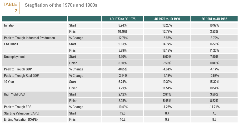
Table 2 evaluates the classic stagflation period of the mid 1970s period to the early 1980s. Until the 1970s, many economists believed that there was a stable inverse relationship between inflation and unemployment. Stagflation upended this assumption by combining stagnant economic growth, high unemployment, and high inflation.
We break this era up into three distinct periods. The first began in late 1973, the starting point for five quarters of negative gross domestic product growth that ended in the third quarter of 1975. Unemployment peaked at 9% in May 1975, two months after the recession ended. The oil embargo in October of 1973 catalyzed the first recession period. The embargo caused oil prices to quadruple, triggering inflation that soared to a peak of 12%. The Federal Reserve’s attempts to fight stagflation only worsened it. Between 1971 and 1978, it raised the fed funds rate to fight inflation, then lowered it to fight the recession. The Fed’s “stop-go” monetary policy confused businesses which kept their prices high, even when the Fed lowered rates. This policy and more importantly, the uncertainty that that it caused in the private sector along with the second oil crisis in 1979, helped lead to a repeat scenario in 1979. That year saw persistently rising inflation and inflation expectations which climbed to 14% by 1980. Federal Reserve Chair Paul Volcker ended stagflation by raising the fed fund rate to 20% in 1980. But it was at a high cost. It created the 1980-82 recession.
Why The 1970s to 1980s Stagflation Scenario Is Less Likely Today
Three preconditions led to the unusual relationship between growth and inflation during the stagflation period of the 1970s:
- Government policies that disrupted normal market functioning. Notably, the 1973 recession was preceded by a mild recession in the early 1970s. The series of policy measures by the Nixon administration to combat the recession helped sow the seeds of stagflation: a 90-day freeze on wages and prices that conveniently ended by the 1972 presidential election; a 10% tariff on imports, and the removal of the U.S. from the gold standard that propelled the price of gold and sunk the dollar. These last two policies raised import prices, which slowed growth by constraining U.S. companies’ ability to raise prices to remain profitable. Since they couldn’t lower wages either, the only way to reduce costs was to lay off workers. That increased unemployment. In other words, the Nixon administration’s three attempts to boost growth and control inflation had the opposite effect.
What’s different today? First, the removal of the dollar from the gold standard, which led to a sharp rise in the price of imports, was a once-in-a-lifetime event. Second, unlike the 1970s, escalating trade tensions have not materially impacted inflation or inflation expectations as yet, but they have primarily served to increase business uncertainty and exacerbate the decline in industrial production that could tip the global economy into a recession. Recently for example, the OECD has downgraded its global forecasts, in part as a result of escalating trade tensions.
- Changes in the Fed’s reaction function. As mentioned previously, the Fed’s stop-and-go policies in the 1970s were ultimately counterproductive. The initial stagflation period preceded the Federal Reserve Reform Act of 1977, which explicitly set price stability as a national policy goal. Moreover, the decline in inflation and the emergence of stable inflation expectations that began in the early 1980s (when high real interest rates contributed to recession in many advanced economies) was reinforced with the adoption of inflation targeting by many central banks in the early 1990s. In more recent years, realized inflation outcomes have been below central bank targets in several major economies, despite unprecedented monetary stimulus.
What’s different today? In addition to a clear focus on price stability, with the conventional monetary instrument – short-term interest rates – already zero or negative in much of the developed world and extremely low in the U.S., the Fed and central banks globally are facing a zero lower bound constraint. In past recessions, interest rates have typically been moved down by around 500 basis points – in 2007, from over 5% to almost zero. This shift isn’t possible now without negative rates. Aggressive monetary policy after the 2008 global crisis was effective in preventing a repeat of the 1930s depression and fostering the recovery. But this experience also demonstrated that context matters: expansionary monetary policy settings had to battle against strong headwinds, as households and companies were constrained by their damaged balance sheets and bank’s inability to lend. However, monetary policy may be less effective in current circumstances because of the following:
- A constraint in aggregate demand. The short-term impact of low interest rates bringing forward expenditures and investments could “leave a hole” in future expenditures; particularly when aggregate demand does not support continued investment. Moreover, consumers and businesses have already taken advantage of the low rates of the past decade to expand their borrowing, and will eventually face leverage limits; particularly if the growth environment cannot support increased leverage.
- Excessive risk seeking. When low interest rates are maintained over a long period of time, their beneficial impact (to revive animal spirits and encouraging risk-taking) can become counterproductive: encouraging excessive risk-taking and facilitating projects which are not viable when interest rates return to normal. Consequently, “Zombie” firms remain in business, so resources don’t shift to better uses. As evidence of these enhanced risks, there are mounting concerns about leveraged loans and the increased proportion of BBB-rated paper in bond-fund portfolios, only one downgrade away from no longer being eligible as “investment grade”. This is a topic which we will explore further in this paper.
- The impact of oil supply shocks. Both the recessions in the 1970s as well as the 1980 recession were preceded by an oil supply shock. The tipping point for the 1973 recession was the proclamation by the members of the Organization of Arab Petroleum Exporting Countries of an oil embargo to protest nations perceived as supporting Israel during the Yom Kippur War. By the end of the embargo in March 1974, the price of oil had risen nearly 400%, from US$3 per barrel to nearly $12 globally; whilst U.S. prices were significantly higher. This first oil shock was followed by a second in 1979, which was caused by a decrease in oil production in the wake of the Iranian Revolution. Despite the fact that global oil supply decreased by only ~4%, widespread panic resulted, driving the price far higher. The price of crude oil more than doubled to $39.50 per barrel over the next 12 months, and long lines once again appeared at gas stations, as they had in the 1973 oil crisis. The third oil supply shock followed the outbreak of the Iran–Iraq War in 1980; when oil production in Iran nearly stopped, and Iraq’s oil production was severely cut as well. Economic recessions were triggered in the United States and other countries. Oil prices did not subside to pre-crisis levels until the mid-1980s.
What’s different today? Although oil price shocks have had a robust history of catalyzing U.S. recessions, the U.S. economy’s relationship with oil has changed over the years. First, the emergence of shale fracking technology has turned the U.S. into a significant energy producer, meaning that a large portion of the economy actually benefits from higher prices. Second, substitution away from oil, improved fuel efficiency and the growth of the service sector relative to manufacturing have all lessened the negative economic impact from higher oil prices. A 2018 report from the Federal Reserve Bank of Dallas summarized the recent academic literature on the topic and noted that a 10% spike in the real oil price might be expected to shave 0.1%-0.3% off real GDP. This modest figure is consistent with what occurred in 2014 and 2016, when the U.S. economy saw a negligible bounce in activity even as the oil price plunged from above $100 to below $30.
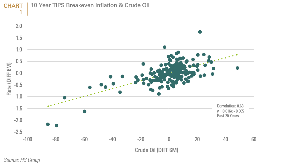
However, in light of the relationship between inflation expectations and oil prices and the importance of the former on the Fed’s interest rate policy, U.S. asset prices could be more vulnerable to an oil shock than the U.S. economy. As shown below, inflation expectations are highly correlated with oil prices (Chart 1). Rising inflation expectations could reduce the probability of further rate cuts; and with asset markets currently priced for continued Fed easing, they could be more vulnerable to an oil shock than the U.S. economy.
Additionally, although the U.S. economy has become less sensitive to an oil supply shock, important parts of the global economy (China, Japan, Europe, India) remain vulnerable; and thus, the supply shock resulting from a prolonged increase in oil prices could emanate from Asia or Europe.
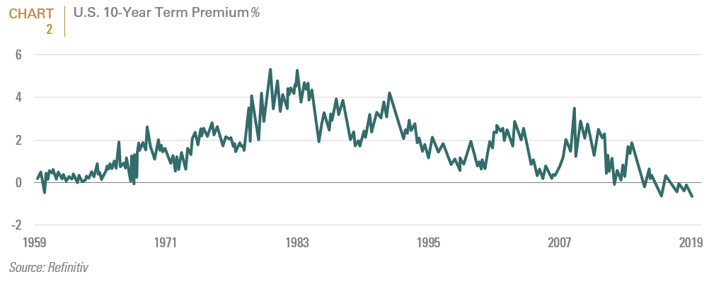
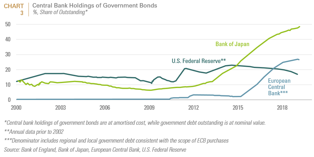
Another factor worth considering is the structural pressure on long-term interest rates due to the rising importance of price-insensitive buyers. Nominal long-term bond yields are a function of inflation expectations, term premium and expected short term real rates. However, over time and particularly in the post GFC era, the rising influence of price-insensitive buyers (relative to the supply of long-term debt securities) has gradually suppressed 10-year term premiums along with extremely low inflation expectations (see Chart 2). Most notably, quantitative easing (QE) programs in the wake of the Global Financial Crisis absorbed part of the supply of long-term government bonds available to the private sector (see Chart 3). The Federal Reserve’s QE program alone is estimated to have compressed the U.S. 10-year term premium by around 100 basis points, although this is likely to have partly unwound of late. In addition, there has been increasing demand for long-term government bonds from other price-insensitive buyers, such as insurers and defined benefit pension funds, despite very low or negative interest rates. Due to aging populations, these purchasers often have significant long-term liabilities with maturities that are longer than those of many financial assets. The resulting maturity gap means that the decline in bond yields increases the present value of these firms’ liabilities by more than the present value of their assets. As a result, these entities have an incentive (and are often required by regulation) to purchase additional long-term assets to hedge interest rate risk. Finally, financial institutions have also increased their holdings of such assets, partly to meet requirements under stricter liquidity regulations in the wake of the GFC. The combined impact of these price-insensitive buyers has been to put downward pressure long-term interest rates.
Additionally, asset return sensitivity today has been highly influenced by slow-moving structural factors that depress both potential growth and inflation. These factors include aging populations, rising savings and falling capital investments as a share of income. This, along with lingering dislocations caused by the GFC, is why rampant concerns about the possibility of inflation in 2011 in response to the Fed’s expansive monetary policies whilst Congress enacted expansive economic stimulus package, proved unfounded.
What are the most likely catalysts of the next downturn?
As mentioned in Part 1, we do not expect a recession over the next 12 months as a result of the lagged effects of China’s reflation as well as the political exigency of negotiating a trade war reprieve prior to the 2020 election. Additionally, we expect continued subdued growth and inflation in a global economy that will remain dependent on accommodative and in some cases, extreme monetary policy settings.
Going forward, the aforementioned mitigating factors and structural market changes render the extreme 1970s style stagflation scenario less likely. We believe that the next recession will most likely be caused by the current manufacturing recession metastasizing to the consumer sector. Currently, the combination of slowing demand, bloated inventories, protectionist trends, Brexit uncertainty and a resilient dollar are holding the global industrial cycle hostage. The downturn in the global manufacturing sector was extended to a fourth month in August and new orders contracted at the fastest rate in nearly seven years, led by the steepest reduction in international trade volumes since late-2012. The outlook also darkened, with business optimism dropping to its lowest level since it was first tracked by the survey in July 2012. The recent relapse in the EM services PMI is also concerning – although the clear shift of major EM central banks towards monetary easing should cushion the blow to economic activity. The longer the industrial sector falters, the more visible the spillover to overall earnings and employment is likely to become. It is therefore concerning that hiring and wages are already slowing in tandem with corporate profits. Correspondingly, the University of Michigan Consumer Sentiment Index posted its largest monthly decline in August of 2019 (-8.6 points) since December 2012 (-9.8 points), with the YOY change declining to -6.7%.
With this tenuous backdrop and discount rates flirting with the zero-bound constraint, the global economy would obviously be more vulnerable to either an inflationary or deflationary shock. An inflationary shock would most likely arise from a geopolitical event which sustainably raised inflation expectations. The key risk here is that risk asset prices currently discount expectations of further central bank interest rate reductions; a probability which would be reduced or halted if inflation expectations sustainably rose. We agree with Professor Roubini’s thesis (referenced in Part 1) that the two most likely sources of this kind of shock would be an escalation of the trade war and/or a more serious and sustained conflagration in the Middle East.
Alternatively, if nominal rates can’t fall alongside prices, then real rates necessarily have to rise and could cause a deflationary shock. The most likely source of a deflationary shock would be a major company or sector failure. The Financial and specifically the banking sector could be such a candidate, as there is growing evidence that low long-term interest rates and flat yield curves are weighing on banks’ profitability and affecting pension funds’ and insurers’ ability to meet their obligations. With interest rates already so low, a deflationary shock, would create a potentially toxic environment for asset markets. Should there be a deflationary bust, the GFC provides the most relevant analog; with the exception that as noted above, low to negative discount rates today provide less room to maneuver to stabilize markets than at their pre-GFC levels.
Asset Price Responses Over Select Prior Downturns
For institutional investors, it is the threat of the bear market that often precedes a recession which compels them to incorporate asset protection diversification strategies. A bear market is defined as a 20% drop from the most recent S&P 500 all-time high. Bear markets are associated with four macro indicators: recessions, commodity spikes, aggressive Fed tightening, and/or extreme valuations. The most common factor, unsurprisingly, was a recession, which has coincided with a bear market eight times. This was followed by extreme valuations (five times), commodity spikes (four), and aggressive Fed tightening cycles (four).
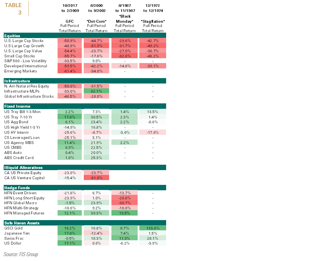
Table 3 evaluates the return of various asset classes and sectors within those asset classes during bear markets associated with two of the recessions analyzed previously as well the first stagflation period between December 1972 and December 1974. The table also incorporates the August 1987 to November 1987 “Black Monday” bear market, which was caused by the collision of trading strategies that engaged in arbitrage and portfolio insurance strategies (which rapidly sold stocks as markets fell) with structural market conditions, such as overvaluation, illiquidity and market psychology.
The results in table 3 suggest that among equity strategies, low volatility strategies provide the strongest protection during bear markets. Not surprisingly, fixed income strategies that were less exposed to corporate default risk provide the strongest ballast during equity bear markets, with intermediate and core bond strategies, as well as securitized products, such as U.S. agency MBS and CMBS performing relatively well during the GFC and dot com bear markets. Real Assets are proxied by a basket of publicly traded infrastructure companies, the Natural Resource ETF and Infrastructure MLPs. We are aware that many institutional investors access these asset classes through private market vehicles; so these proxies might overstate their sensitivity to public equity market downturns. On the other hand, their illiquidity might exacerbate that sensitivity in the case of distressed sales. Infrastructure MLPs generated strong positive performance during the dot com bear market but both global infrastructure stocks and natural resource equities had negative returns. During the GFC, all three had significant negative performance, though they generally declined less than the broad stock market indices. Hedge funds had more nuanced performance. During the dot com bubble, all of the hedge fund strategies evaluated generated positive returns; whilst global macro and managed futures were the highest performing strategies. During the GFC bear market, only managed futures generated positive returns. Additionally, because of the nature of the “Black Monday” bear market, all of the evaluated hedge fund strategies, with the exception of managed futures, had heavy losses. For private markets strategies, we used Cambridge Associates’ U.S. Private Equity and Venture Capital Indices. These indices utilize the quarterly unaudited and annual audited fund financial statements produced by the fund managers (GPs) for their limited partners (LPs). Consequently, they would be expected to incorporate at least a one quarter lag, and more importantly, be upwardly skewed by survivorship bias. This bias occurs when fund managers stop reporting before their fund’s return history is complete, skewing the reported returns upwards if the funds dropping out had poorer returns than those funds that remained.1 During the dot com bear market, both private equity and venture funds generated heavy losses; with the losses on venture funds exceeding that of public equity markets. During the GFC, private equity and venture fund losses were about one-half of the losses generated by public equity markets. For those allocators that engage in direct investments, traditional safe haven strategies such as gold, the Japanese Yen (except for the dot com bear market) and the Swiss Franc were also clear standouts.
The stagflation analysis in table 4 shows that equities underperformed bonds and non-U.S. stocks outperformed U.S. stocks. Among fixed income sectors, short and intermediate strategies outperformed longer duration strategies. Credit risk was also less rewarded during this period, as both the aggregate and high yield bonds underperformed.
Because of the small sample size available for historical stagflation periods, we extended the analysis using inflation expectations to define both inflationary and stagflationary periods between 1970 and Q2 2019 in Table 4. Our approach is consistent with the method posited by the authors Page, Pedersen and Guo which was used in a subsequent PIMCO study on inflation regimes2 that demonstrated that inflation surprises are a more significant driver of asset returns than just the level of inflation. Consistent with their study, we defined inflation surprises as the difference between actual inflation at the end of the quarter and expectations for inflation at the start of the quarter. A period is designated as “high inflation” if inflation surprise is in the highest 25% of historical inflation surprises. Additionally, we defined stagflation periods as periods during which GDP growth was in the bottom 25% and inflation was in the top 25% of observations.
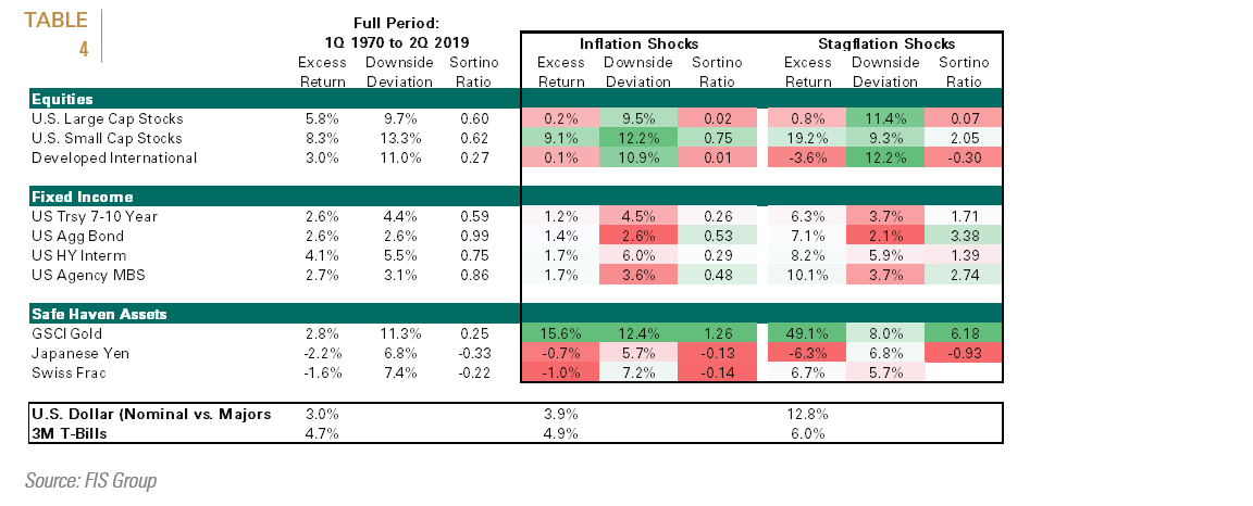
Through the prism of inflation surprise (as opposed to levels during the 1973 bear market), we get a more nuanced story. Table 4 evaluates excess returns relative to 3-month T-Bills, which over the full period was 4.7%. It was 4.9% in inflation surprise shock periods and 6.09% in stagflation periods. Unlike the 1973 period, the U.S. dollar appreciated in both periods, but particularly in the stagflation scenario. This relationship seems somewhat counterintuitive, as inflation generally depreciates the relative value of a currency. We believe that this difference results from the longer analysis period in which the U.S. dollar appreciated by 3%. Additionally, the use of the top 25% threshold to identify periods of inflation surprise incorporates periods that are not generally thought of as inflationary in isolation. Therefore, in a period characterized by very low or negative inflation growth, these periods would rise above the top 25% threshold. We attribute U.S. stocks’ outperformance of non-U.S. stocks primarily to the U.S. dollar’s appreciation. The table also evaluates the Sortino ratio for each asset class or segment; which is a modified version of the Sharpe Ratio which only penalizes downside volatility. As with the 1973 bear market, bonds outperformed stocks in both periods; with the exception of small cap stocks, which outperformed both bonds and large cap stocks during both periods. Among bond sectors, core bonds (as represented by the U.S. Agg bond index) had a higher Sortino ratio than other sectors and U.S. agency MBS had the second highest ratio in both periods. Not surprisingly, gold also outperformed in both periods.
As further confirmation of the sensitivity results in Table 4, Chart 4 evaluates different U.S. equity styles and capitalization sectors over the 15-year period between 12/31/2003 and 12/31/2018 for three stress scenarios:
- 20% increase in the price of crude oil
- 100 bps increase in expected inflation
- 150 bps steepening of the yield curve
First, this analysis shows that inflationary periods are the most supportive of equity assets relative to both stagflation and an oil supply shock. Second, consistent with the analysis shown in Table 4, small caps stocks outperformed in all three stress scenarios. Additionally, the data suggests that value stocks would be expected to outperform growth stocks in all three scenarios.
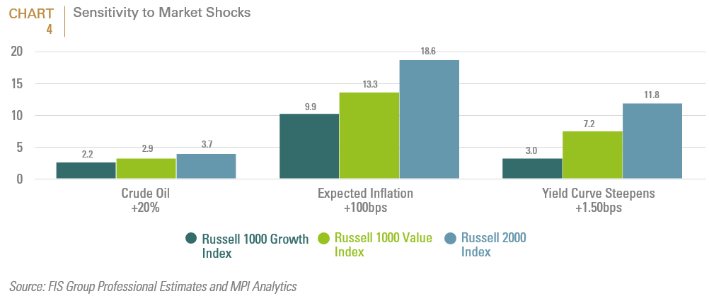
As noted from the analysis of the results from Table 4, during both the inflation surprise and stagflation shock periods, the U.S. dollar appreciated. With this backdrop, companies that generate sales or whose input prices are primarily derived from the domestic economy would logically be expected to be least impacted by an appreciating U.S. dollar. We believe that the consistent outperformance of small caps stocks during inflation and stagflation periods is attributable to the fact that small companies are more focused on the domestic economic cycle than their large firm counterparts. Similarly, value stocks are also more exposed to the domestic economy than growth stocks, which tend to be more exposed to non-U.S. markets, both in terms of sales and supply chains. Moreover, to the extent that rising inflation expectations and a steepening yield curve reflect expectations of an improving economy, both value and small stocks would be expected to outperform growth stock companies, whose organic growth ability tends to require less operating and financial leverage.
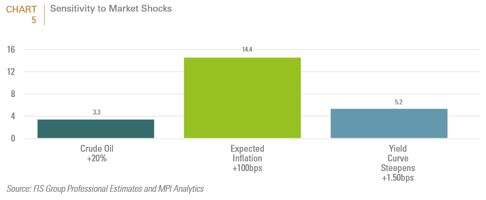
Chart 5 evaluates non-U.S. stocks over the same period using the same macro shock events. As with U.S. stocks, inflation periods are the most supportive for non-U.S. stocks.
While the asset price sensitivity analyses based on prior returns provide a useful guide, it is critical to remember that the causes and anatomy of every major recession are different with varying economic and geographic epicenters. Consequently, there are no assets that one can say will always hedge every recession effectively. One way to identify which assets are likely to be most vulnerable is to gauge whether they have either become unhinged from their fundamental underpinnings or appear to be rapidly attracting assets as investors reach for additional return or yield. Consequently, we conclude with an analysis of three sectors that we believe are most vulnerable to a negative surprise: high yield bonds and leveraged loans, as well as long duration growth stocks and private equity LBOs. We also posit that at current low starting yield, long duration core bonds strategies are likely to provide less downside protection than prior downturns.
Fixed Income
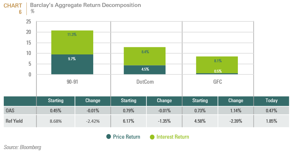
Fixed income securities have traditionally been an important component of any portfolio derisking strategy. Over the past 30 years, interest income has been a significantly larger piece of the return pie during economic downturns; whilst spread compression has been a less significant source of return. For example, during the 1990-1991 recession, interest return was for the source of 53% of the U.S. Barclay Agg.’s return; while during the GFC, interest return comprised 94% of the index’s return. (See Chart 6). Consequently, the starting yield and length of crisis explain essentially all the interest income of core bonds.
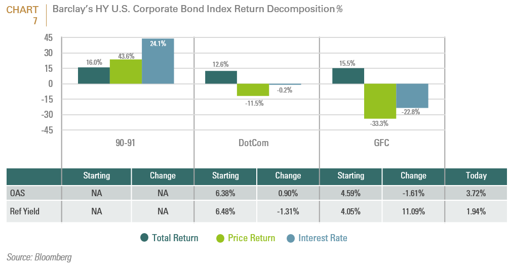
The importance of income and starting yields is even more important for high yield bonds due to likely spread compression. During the 1990-1991 recession, interest income accounted for 36% of the Barclay’s HY U.S. Corporate Bond index’s return; whereas during both the dot com bear market and the GFC, interest return was the only positive contributor. (See Chart 7).
Both Chart 6 and Chart 7 show that starting yields today for both investment grade and high yield bonds were much higher than at the beginning of all of the prior downturns that we evaluated. Unlike prior periods, there is a record amount of debt (over US $16 trillion) trading at negative yields and over US $30 trillion of debt trading with negative real yields. There are now negative sovereign yields across Europe, negative sovereign yields out to 15 years in Japan, a negative real yield out to 10 years in the U.S. Treasury market (June CPI was 1.648% and the 10-year yield is now 1.635%) despite a budget deficit that the Congressional Budget Office (CBO) forecasts will exceed $1trillion.
As discussed earlier, negative or extremely low yields partially reflect the impact of price-insensitive buyers. These buyers included central banks engaging in quantitative easing (QE) programs or asset purchase programs; financial institutions that have increased their holdings of sovereign debt to meet stricter liquidity requirements and; insurers and defined benefit pension funds which have significant long-term liabilities. The combined impact of these price-insensitive buyers has been to put downward pressure on long-term interest rates.
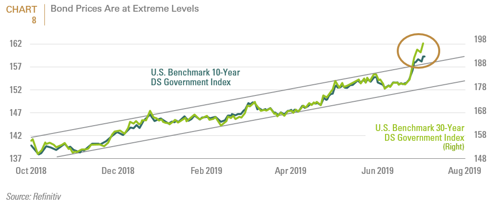
That said, at current prices, bonds are priced for recession and valuations are extreme. (See Chart 8). Therefore, even considering the impact of price insensitive buyers, it is hard to imagine that the bond market’s reaction function has become completely price inelastic; particularly if it continues to plumb both real and nominally negative yields. At a minimum, even if bonds do provide some diversification relative to equity risk assets during the next downturn, at current price levels, we would expect more muted protection than what occurred in prior recessions.
For further illustration, table 5 below evaluates the yield for the 10-year Treasury bond at the beginning and end of each of the four bear markets analyzed in table 3 (above) three and compares this range with the current yield on the benchmark rate. Assuming a duration of nine years, we also calculate how far the yield on 10-year treasuries would have to decline in order to generate the same return that it generated for each period.
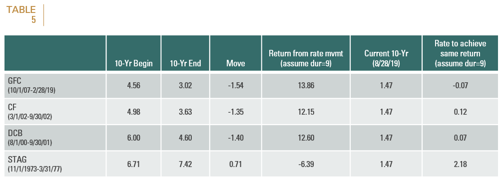
To illustrate, at the beginning of the GFC, the 10-year treasury’s yield was 4.56%. At the end of the period, its yield was 3.02%, leading to a pick-up in return of 13.86%. With the current yield on the 10-year treasury of 1.47%, in order to achieve the same return, its yield would have to fall below zero. In the stagflation scenario, rising interest rates (by .71%) caused a 6.39% loss. Given that yields today are trading well below the starting point of that period, the loss attributable to the increase in interest rates would be even worse. For allocators that either have reduced or are planning to reduce their equity allocations in favor of conventional core bond portfolios, this latter scenario also provides a cautionary, albeit more extreme warning, should the term premium normalize if the global economy improves. To some extent, corporate spreads would presumably narrow with a cyclical upturn and help to offset price decline attributable to a rising yield; but they are unlikely to provide a return boost similar to prior cyclical reversals. As noted in Part 1 of this series, although both investment-grade and high-yield corporate bond spreads have ticked up recently, they remain near the bottom of their post-crisis range and are nowhere near the levels they reached in prior risk-off periods, such as the federal budget showdown/U.S. downgrade in 2011; the flare-up of the Eurozone crisis in 2011-12, and during the last manufacturing recession in 2015-16.
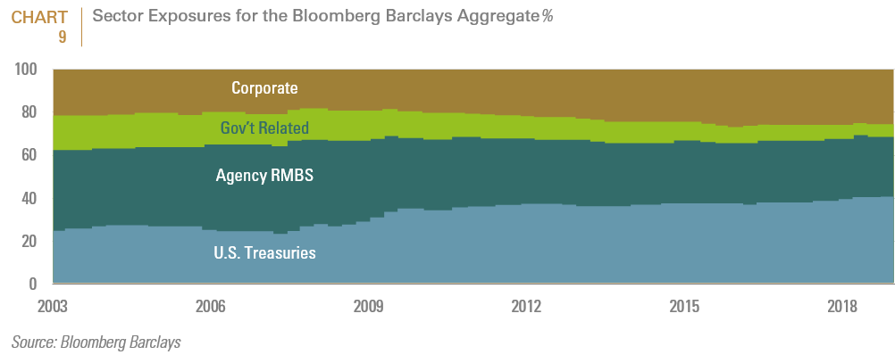
Another potential source of vulnerability is the changing characteristics of the Bloomberg Barclays Aggregate Index, which is commonly utilized to benchmark investment grade core bond strategies. The index’s constituents include U.S. Treasuries, agency debt, residential and commercial mortgage-backed securities, asset-backed securities, and corporate bonds. As the U.S. budget deficit has grown, the allocation to Treasury issues has markedly increased, from 18.25% in 2000 to 40% in 2019. (See Chart 9).
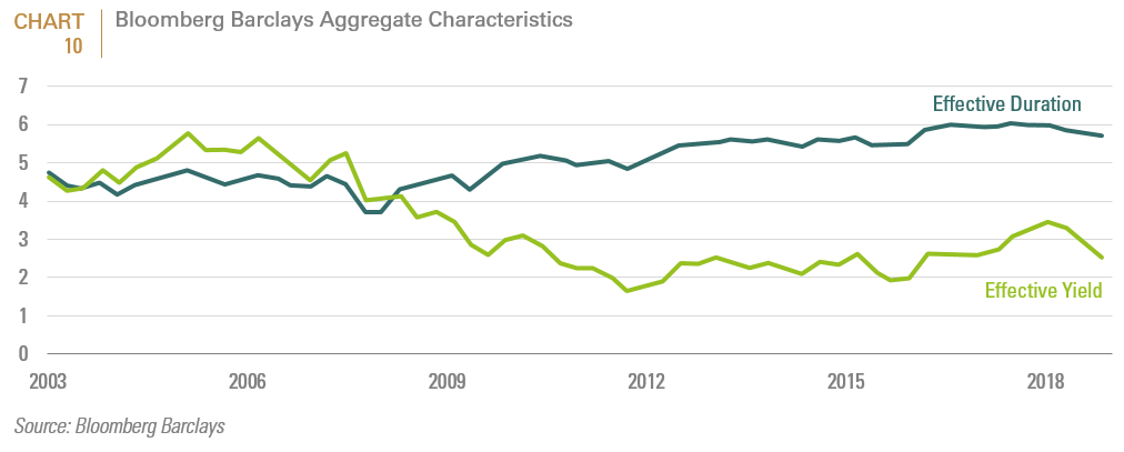
Importantly, the index’s changing sector composition as well as today’s lower interest rate environment has resulted in steadily declining yields and a more extended duration. (See Chart 10). As a rule of thumb, for every 1% change in interest rates, the price of a bond will move 1% in the inverse direction for every year of duration exposure. Therefore, a 1% increase in interest rates will reduce the price of a bond with a duration of 5 years by 5%, all else being equal. Going back to June 30, 2000 and comparing the equivalent characteristics as of June 30, 2019, the duration of the Aggregate was shorter (4.91 years versus 5.73 today), and the yield to worst was higher (7.23% versus 2.49%). The upshot is that the Aggregate’s exposure has become more interest rate-sensitive over time, and its lower yield provides less income and less of a cushion in the case of rising rates.
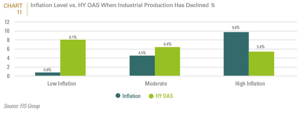
Additionally, the “level” of inflation matters when economic growth is declining. In the prior 3 pullbacks, growth and inflation fell, but the level of inflation was much higher than it is today. The inflation level matters for the level of credit spreads. A low inflation environment can be a headwind against corporate credit risk. With fixed cost liabilities, debt repayment eases with higher levels of inflation (though not inflation shocks). Chart 11 shows the average levels of HY OAS during time periods of declining Industrial Production (rolling 12m). By separating the data into inflation regimes, one can see that low inflation has been associated with higher levels of credit risk when the economy falters.
Since the GFC, the total of high-yield bonds and leveraged loans outstanding in Europe and the U.S. has doubled to about $2.65 trillion, according to the Basel, Switzerland-based Bank of International Settlements (BIS). While high-yield bonds still account for more than half the tally, growth in lending to risky companies has outpaced sales of those securities, and leveraged loans now account for almost 45 percent of the market. Leveraged loans, which refer to syndicated loans given to already leveraged issuers, represent another vulnerable sector of the fixed income asset class. On the surface, leveraged loans look similar to high-yield bonds, but there are important differences. Unlike high yield, leveraged loans have limited interest rate risk because they have a floating rate feature. As a result, leveraged loans are protected from rising yields on treasury securities. They also are typically senior securities to high yield bonds in the capital structure. Additionally, they are often sold in packages (called collateralized loan obligations, or CLOs) to other investors much the same way as mortgages are bundled for people who want the stream of cash flows from a mortgage-debt investment. Lenders receive a high rate of interest because the risk of failure is comparatively high.
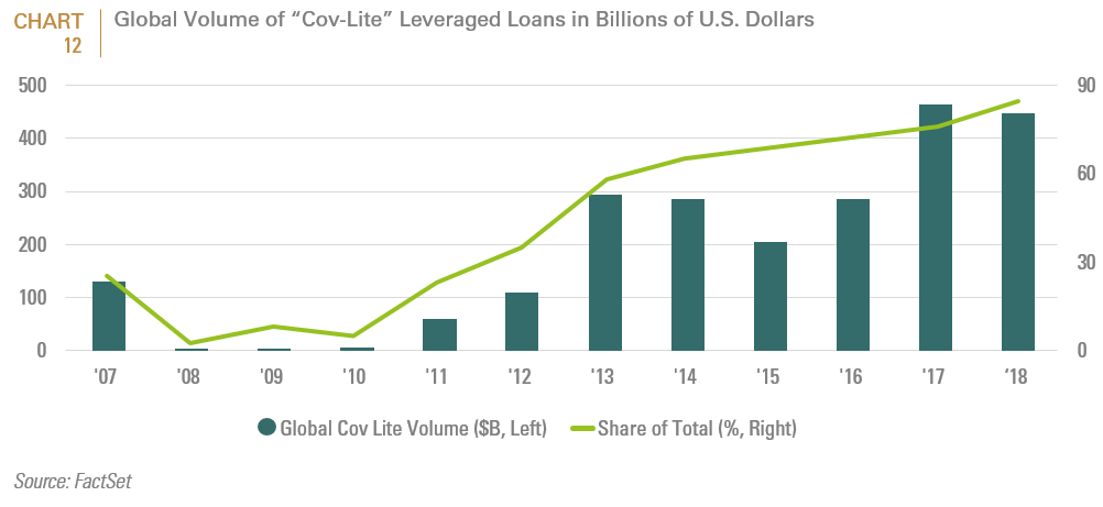
The total of outstanding leveraged loans on the market is around $1.6 trillion; but estimates vary (see Chart 12). The total of leveraged loan new issuance was over $700 billion in 2018. The risks associated with leveraged loans are twofold:
- The increasing use of “covenant-lite” issues. By the end of 2018, 85% of all leveraged loans were “covenant-lite,” according to the Leveraged Data & Commentary unit of S&P Global Market Intelligence. In Europe, where 87% of leveraged loans were “cov-lite” the situation was even worse. In the U.S., almost 80 percent of newly issued loans are now covenant lite, compared with less than 25 percent in 2006 and 2007, according to Moody’s (see Chart 12). In periods of ample liquidity, lenders don’t value covenants and they’re willing to lend at very high leverage values. A negative shock could lead to fire sales by loan funds if ratings downgrades push some of their investments into junk.
- Complacency over expected default rates (that typically rise in recessions). According to Moody’s Investor Service, default rates are likely to drop to 2 percent on a global basis by year-end, down from 2.8 percent. But that projection is based on a continuation of positive economic growth.
We have posited that HY corporate credit and leveraged loans are unlikely to be immune from losses and widening credit spreads. We have also argued that currently low starting yields increase the probability of negative skew for bond prices. Additionally, we have counseled that relative to prior recession periods, though it would be expected to provide better downside protection than either high yield or leveraged loans, the Barclays Aggregate has become more interest rate-sensitive over time, and its lower yield provides less income and less of a cushion in the case of rising rates. The most resilient fixed income sectors are likely to be short to intermediate duration, higher credit quality and/or idiosyncratic bond strategies. Bond securities that provide attractive yields but are less correlated to equity beta (such as floating rate notes, asset-backed securities (ABS) and commercial mortgage backed securities (CMBS) and those that provide optionality are also included in this category. ABS represent approximately 0.53% of the index and substitute structure instead of credit risk, and they are short duration with little price vol. CMBS represent 2.16% of the Aggregate index, and the key risks that need to be managed for these issues are the regional economics of the commercial real estate market. Both are reasonably defensive, with short duration and low volatility. For investors not interested in betting on rates, we recommend short duration High Yield bonds. The BofAML 0-5 Year U.S. High Yield Constrained Index offers almost identical yield, with half the duration of the traditional HY index.
Equity Markets
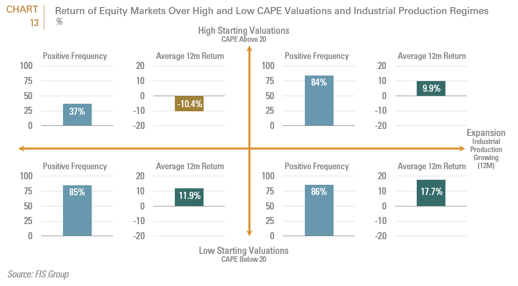
Chart 13 evaluates subsequent equity returns during periods of industrial product expansions and declines relative to high and low valuation starting periods since 1950. It is difficult to build a case that equity markets won’t contract in a slowdown. Since 1950, whenever CAPE valuations were above 20 and industrial production declined in the previous 12 months, the 12-month return of the stock market was -10.4%, with only 34% of periods having positive returns. Currently, the CAPE ratio at 30.3 exceeds all of the three prior downturns analyzed in this paper with the exception of the peak of the dot com bubble. However, for allocators whose long-term funding objectives require an equity allocation, the key to asset preservation during economic downturns is avoiding the most vulnerable markets. We believe that long duration growth equities as well as leverage buyout private equity strategies appear to be most vulnerable.
Long Duration Equity Strategies
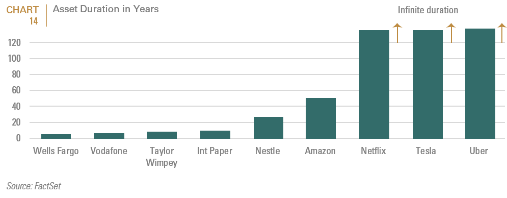
With ultra-low interest rates and the comfort of a central bank “put”, investors have favored high duration assets and often cash-flow burning companies (such as Tesla, WeWork and Uber) that are perceived to have very high residual values because of their “next- gen” business models. Conversely, they have shunned companies in sectors with near term cash-flows (such as energy, autos, electric utilities, mass-produced consumer goods)—where residual values were perceived to have limited value. (See Chart 14). Indeed, the entire structure of global equity markets; the bifurcation in valuations between unloved value and overvalued growth stocks; and the massive asset flows into VC, ETF, passive, and AI or algo-driven momentum trading are predicated on the assumption that the Fed will prevent a sustained widening of credit spreads.
Going forward, we believe that many downside scenarios will lead to the market beginning to favor cash-flow-producing businesses at the expense of cash-flow-burning businesses. Additionally, we believe that the structural and cyclical factors that propelled 50-year highs in U.S. corporate profit margins (particularly for growth stocks) over the last 20 years have likely peaked, and in many cases are at serious risk of reversal.
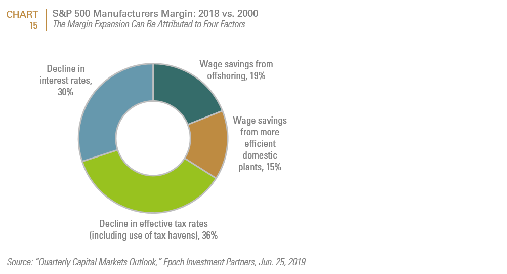
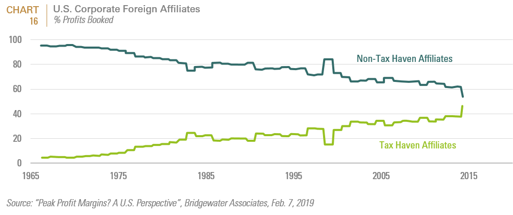
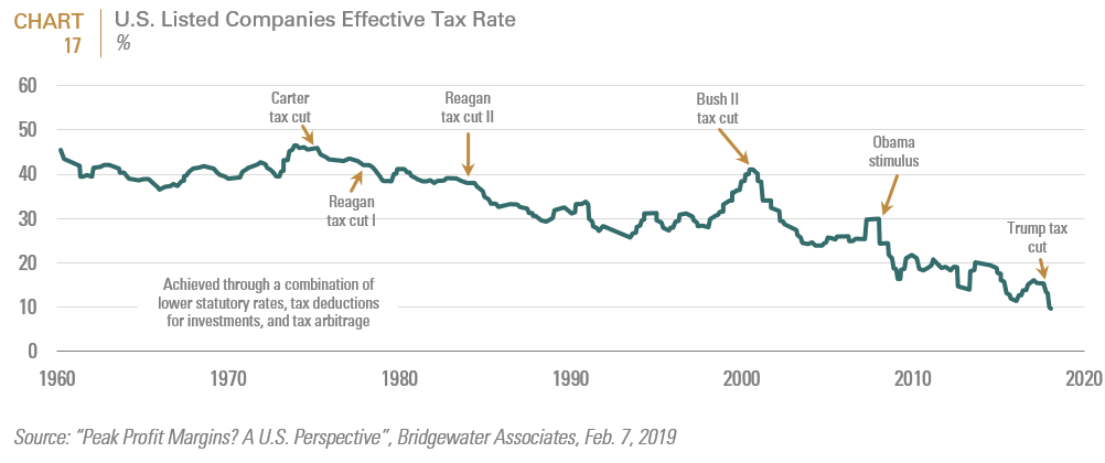
Chart 15 shows that 36% of S&P 500 companies’ margin improvements was attributable to declining effective tax rates, whilst another 30% was attributable to declining interest rates. Currently, the effective tax rate is at an all-time low through a blend of tax cuts and use of tax havens (see Chart 16 and Chart 17). In light of the U.S.’s ballooning budget deficit, it is hard to believe that current tax rates for large corporations will not be challenged, should the Democrats prevail in the 2020 election. Minimally, it is hard to imagine further tax cuts for the corporate sector, should the Republicans prevail.
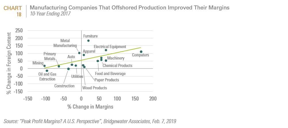
Wage savings attributable to offshoring has allowed companies to improve their margins by another 19%. Not surprisingly, cyclical sectors as well as the computer sector were primary beneficiaries from this trend. (See Chart 18). However, offshoring is clearly facing political headwinds, including the ongoing strategic and technological rivalry between China and the U.S. as well as the resurgence of more populist and mercantilist policies at both the executive and legislative branches.
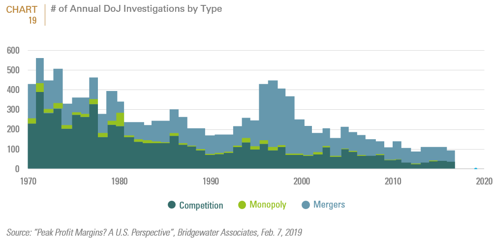
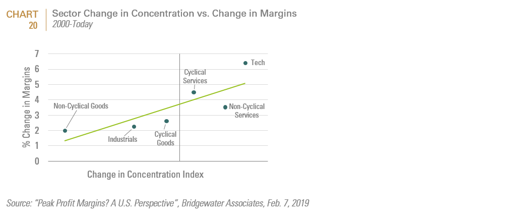
Finally, tech in particular has benefited from lighter regulatory oversight and increased concentration as the sector reaped the network and platform profits that accrued from consolidation (see CHART 19 and CHART 20). Both of these advantages are being challenged as we write.
Peak U.S. Equity Dominance?
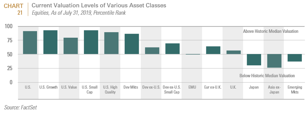
U.S. markets are markedly overvalued due largely to potentially challenged profit margin expansion. (See Chart 21). The safe haven status of the U.S. dollar, as well as the less cyclical exposure and relative dominance of consumer and technology-oriented companies on U.S. markets, has led to their outperformance during and after the GFC. We would never say “this time it is different’, but as discussed above, several of the structural factors that propelled U.S. corporate profit margins (particularly for growth stocks) skyward over the last 20 years have likely peaked, and in many cases are at serious risk of reversal.
Private Equity has also benefited from this backdrop of risk-seeking monetary policy settings because in general, alpha for the asset class is generated by a combination of the ability to source attractive deals, skilled operating leverage as well as financial leverage. In a low return/low interest rate environment; private equity’s focus on high organic growth companies or the use of operating and/or financial leverage to flatter earnings and returns has attracted substantial investment capital. For example, leveraged loans, whose risks were discussed above, are often used by private equity groups to take over companies in leveraged buyouts (LBOs), or by companies who have run into trouble and are locked out of the higher quality corporate credit markets. The “leverage” aspect comes from the notion that such loans are a bet on the future of the company. These loans are “leveraged” against the private-equity group’s assets and its ability to turn a struggling company around while paying off all the debt.
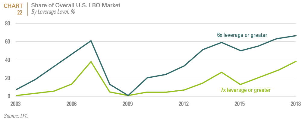
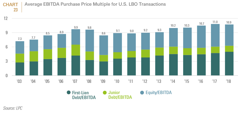
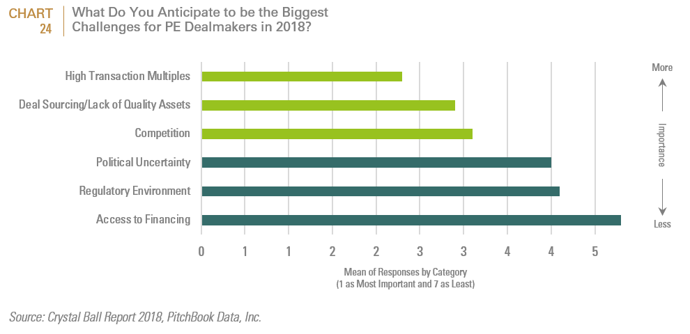
According to Prequin, as of the end of 2018, yet to be invested LP committed allocations (“dry powder”), had climbed to around $2 trillion dollars! Chart 22 and Chart 23 show that leveraged buyout funds, the largest segment within the asset class, has employed increasing amounts of leverage to execute transactions at higher multiples. Both factors were referenced as increasingly challenging by Private Equity GP’s in a study conducted by Pitchbook (see Chart 24). Like long duration growth equities, it is therefore difficult to see how such a strategy would thrive in an environment characterized by multiples contraction and higher default rates.
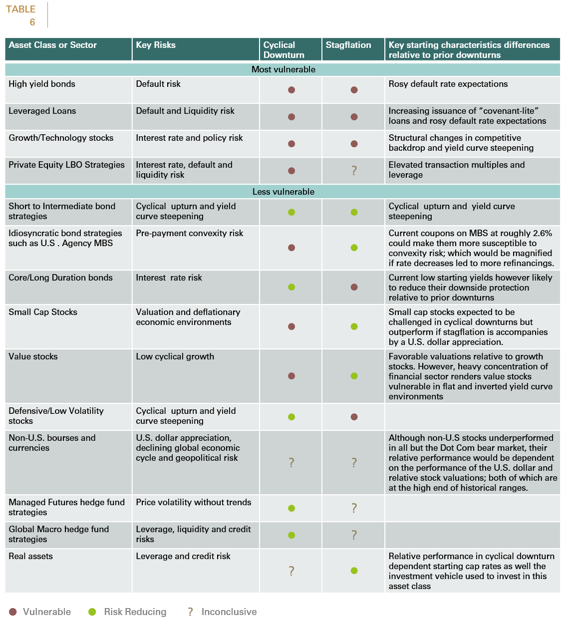
To summarize our recommendations, Table 6 evaluates those assets that we believe would be most vulnerable and warrant overweighting as investors consider derisking for both potential recession scenarios.
In Part 1 of this paper, we discussed the potential opportunity cost of de-risking either too prematurely or drastically cutting equity risk to rush into traditional safe haven assets such as bonds. We posited that at extremely low yields investors could either conclude that the world faces an economic meltdown, or there is a buying panic in safe assets and thus a buying opportunity in risk assets? For allocators, if the latter is correct, then significant equity derisking in the short term could present a meaningful funding opportunity cost. Ultimately, the pacing of derisking should be driven by the balance between an allocator’s short and long-term funding requirements and where their fund’s actual weights are relative to the policy weights embedded in their asset allocation plan (which ideally is designed to meet their funding requirements). But panic-driven and drastic action is rarely rewarded in investing. Therefore, we would recommend a more systematic approach which uses cash flow events (i.e., contributions and payments) in addition to a systematic re-balancing approach which gradually accomplishes revised asset allocation weights over one to two-year period. In Part 3 of the series, we will explore such strategies as well as options-based asset protection techniques.